
Every business runs on processes, but in most companies those processes are close to invisible. The org chart will tell you who reports to whom. It says nothing about how a customer order actually moves from the moment it lands to the moment it ships, or how many hands a new hire's paperwork passes through before they can log in on their first day. That real flow of work tends to live scattered across people's habits, a handful of documents, and a great deal of memory. Process mapping is how you pull that flow out into the open and look at it directly.
It is one of the most useful things an operations-minded team can do, and also one of the most commonly botched. Plenty of guides treat process mapping as a drawing exercise: learn the symbols, arrange some boxes, export a diagram. That gets you a picture, and a picture on its own rarely changes how a business runs. What matters is what the picture lets you see, decide, and change.
This guide takes the wider view. We will cover what process mapping really is, the different kinds of maps and when each one earns its place, how to map an operation without drowning in detail, and how to turn maps into something your team actually runs on instead of a file that gets looked at once and then forgotten. For the nuts and bolts of drawing an individual process flowchart, including the standard symbols, our guide to business workflow diagrams and flowcharts goes step by step. Here we are more interested in the thinking around the maps than in the shapes inside them.
What is process mapping?
Process mapping is the practice of representing a business process visually, from the event that triggers it to the outcome it produces, including the steps along the way, the decisions that branch it, the handoffs between people, and the systems involved at each stage. At its simplest it answers a deceptively hard question: how does this actually get done? When the processes in question are the ones that keep a company running, the same technique is usually more specifically called business process mapping, though nothing about the method itself changes with the label.
The reason that question is hard is the gap between how work is imagined and how it really happens. Ask three people who touch the same process to describe it and you will usually get three different versions, each accurate from where that person sits and incomplete everywhere else. A map forces those partial views into a single shared picture, and the act of building it tends to surface things nobody had noticed, such as a step everyone assumed someone else owned, an approval that adds three days and no value or a piece of work being done twice in two different tools. In that sense a process map is as much a diagnostic instrument as a documentation format. You tend to learn the most while you are still drawing it.
It helps to be clear on where mapping sits among related ideas, since the words get used loosely. A process is the sequence of steps that turns an input into an outcome. A workflow is that sequence as it runs day to day. A standard operating procedure is the detailed instruction for carrying out a step or a whole process. A process map is the visual layer that ties these together and shows how they fit. If you want to go deeper on the distinctions, we pulled them apart in our piece on policies, processes, and procedures, and on the wider management discipline in business process management explained.
Mapping at the right altitude
People often want to know which of the many types of process maps they should use. The most useful answer is that there is no single correct map. The same operation can be drawn at very different levels of zoom, and the level you choose should follow from the decision you are trying to make. Think of it as altitude. From high up you see the whole terrain and how the regions connect, but not the streets. Closer to the ground you see the streets and lose the sense of the whole. Good process mapping means knowing which altitude answers your question, and connecting the altitudes so people can move between them.
The bird's-eye map of the whole operation
At the highest altitude you map the business itself: the handful of core processes that make up the operation, drawn on a single page that shows how each one feeds the next. It deliberately leaves out the steps inside each process. What it reveals is the shape of the whole and the seams between functions, the places where one team's output becomes another team's input and where work tends to fall between the cracks. At its most condensed, this high-level view is sometimes captured as a SIPOC map, which summarizes a process by its suppliers, inputs, outputs, and customers on a single line. This is the view to reach for when you are aligning a leadership team or deciding which part of the operation to fix first, and it doubles as orientation for a new manager who needs the lay of the land before any of the detail.
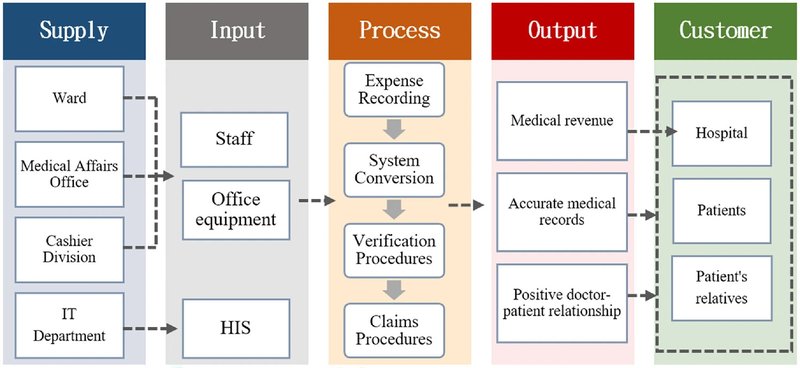
Above: a SIPOC map example (Source: nature.com)
The end-to-end process flowchart
Drop down a level and you map a single process from its trigger to its outcome, with the decisions and branches that real work involves. This is done with process flowcharts. They are the workhorse of process mapping and the format most people picture when they hear the term. It is detailed enough to train someone on, document properly, or interrogate when a specific process keeps breaking, while still fitting on a page someone can follow. As an example, a client onboarding process mapped this way might start the moment a deal is signed and move through account setup, a kickoff call, and the first deliverable, with a decision point for whether the client's paperwork is complete before the process ends and they go live. For more real-life examples you can browse our library of workflow and process map templates, and the mechanics of building a diagram, symbols included, live in our flowcharts guide, so we will not repeat them here.
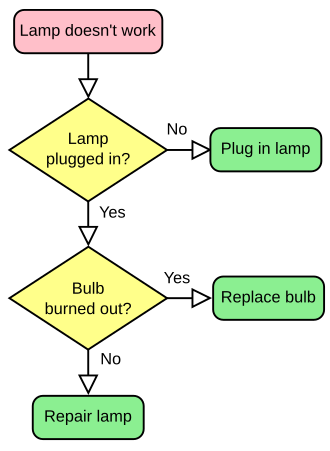
Above: a flowchart example (source: Wikipedia)
The cross-functional, or swimlane, map
The same end-to-end process becomes far more revealing when you organize it by who does each step, with a horizontal lane, or swim lane, for each role or team and the steps placed in whichever lane owns them. Suddenly every handoff is visible as a line crossing from one lane to another, which is exactly where work stalls, gets dropped, or sits waiting on someone who does not know it has arrived. This view earns its place when the trouble is coordination and accountability across departments rather than the steps themselves, because the gaps between the lanes are where most delay quietly accumulates.
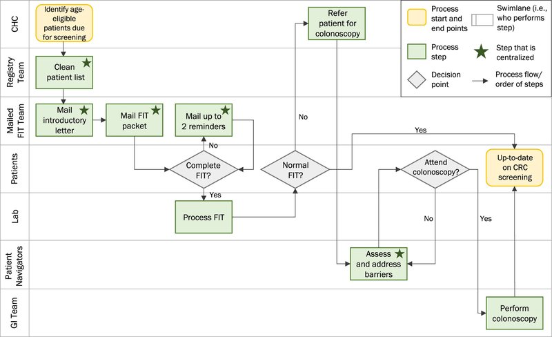
Above: a swim lane map (Source: springer.com)
The task-level view, where the map meets the work
At the lowest altitude the map stops being an overview and turns into the actual instructions for carrying out a step. This is where a map connects to the SOP behind each box, so the person doing the work can open the detailed procedure for whichever step they are standing on without leaving the map. A map that can drill all the way down to this altitude stops being a reference picture and becomes something people work from directly.
Specialized variants sit alongside these altitudes rather than replacing them. A value stream map, for instance, is the format lean teams reach for when the goal is process improvement, since it exposes the time, delay, and waste sitting between the steps, and it reads as another angle on the same operation rather than a separate discipline.
The mistake is mapping at one altitude and stopping there. A map drawn only from the top is reassuring and useless to anyone trying to actually do the work. A map drawn only at task level is precise and impossible to navigate. The value lives in the connection between them, in being able to start with the whole operation and zoom down to a single step and back again.
Why process mapping is worth the effort
The honest case for mapping is straightforward: you cannot improve, delegate, or scale what you cannot see. Almost every operational problem worth solving gets easier the moment the process behind it becomes visible.
When the flow is laid out on a page, the costs that were hidden become obvious. The bottleneck where work piles up behind one overloaded person or one slow approval is suddenly easy to point at. So is the effort being duplicated by two teams who never realized they were both doing it, along with the step that survives only because it has always been there. None of this is visible while the process lives in people's heads, which is exactly why these problems persist for years inside otherwise well-run companies.
Mapping also does something quieter and more strategic. It loosens the grip of key person dependency, the situation where the only working understanding of how something gets done sits inside one person who could leave, fall ill, or simply go on holiday at the wrong moment. A mapped process can be taught, audited, handed over, and improved by people other than its original owner, which turns operational knowledge into a shared asset rather than a private one. That same visibility is what makes onboarding faster, tells you honestly which steps are worth automating, and what gives you a real baseline to improve from instead of a vague feeling that things could run better.
How to map your processes without drowning in detail
The most common way process mapping fails before it even starts is ambition. A team decides to document everything, schedules a dozen workshops, and runs out of energy somewhere around the second. A more durable approach works from the top down and stays ruthless about priority.
Start with the bird's-eye map of the whole operation, even a rough one. Putting your dozen-or-so core processes on a single page, with arrows showing how they connect, takes an afternoon and immediately shows you where the seams are. It also gives you a frame for everything that follows, so each detailed map you draw later has somewhere to hang rather than floating on its own.
From there, resist the temptation to map in order of convenience, and map in order of impact instead. The processes worth detailing first are the ones that run often, touch customers directly, cross several teams, or cause the most damage when they go wrong. A handful of well-mapped critical processes will do far more for the business than a complete set of shallow ones covering work that barely matters.
When you do map a specific process, capture what actually happens rather than the tidy version you wish were true. The people who run a process every day know the workarounds, the exceptions, and the unofficial shortcuts that never make it into any formal description, so map it alongside them rather than from a corner office. Get the current reality down first, ugly parts and all, and keep any improved "future state" as a separate map so you never confuse what is with what you intend. Then validate it by walking real scenarios through the map with the team, since that is reliably where missing steps and wrong assumptions reveal themselves. We work through this single-process exercise in more depth, scope and symbols included, in the flowcharts guide.
The reason most maps stop being useful
Here is the failure mode that wastes more mapping effort than any other. A team gathers, maps a process carefully, produces a clean diagram in a drawing tool, exports it to a PDF or a slide, and considers the job done. Within a quarter something has changed, and the map is quietly out of date. Nobody updates it, because updating it means reopening a file that lives apart from the actual work, so people stop trusting it and drift back to asking each other how things are done. The drawing itself was fine. What undid it was that it was a snapshot of something that kept moving, kept separate from the work it was supposed to describe.
A map earns its keep only when it is connected and alive. Connected means each step links to the detail beneath it, so the overview and the SOP for any given step stay in one place instead of in two systems that slowly fall out of sync. It also means that the map lives where the work happens, carries an owner, and changes when the process changes, with a version history so you can see exactly what moved and roll back a bad edit. That is the real distinction between a process map as a picture and a process map as operating infrastructure.
This connected, living approach is what we built WorkFlawless around. The process flow canvas lets you draw the operation as it actually runs, and each step on the canvas can carry its own SOP, so the high-level view and the step-by-step detail stay linked inside one navigable system. Those same maps then become the backbone of onboarding paths, so a new starter learns the operation by moving through the real thing rather than reading a static handbook, and AI generation can get a first draft of a map or an SOP onto the page in seconds when you are starting from nothing. What makes the difference is having the map, the detail, and the daily work joined up well enough that the map stays true over time.
Common process mapping mistakes to avoid
A few patterns trip up almost everyone the first time around, and they are easy to design out once you know to watch for them.
- Mapping the ideal instead of the actual. A map of how a process is supposed to work, when the real one runs differently, is worse than no map at all, because it carries an air of authority while being wrong.
- Staying at a single altitude. Maps that are all overview leave nobody with enough to act on, and maps that are all detail become impossible to navigate. The goal is to connect the levels rather than perfect one of them.
- Trying to map everything at once. Full coverage is a long-term ambition, not a launch plan. Depth on the processes that matter beats breadth across the ones that do not.
- Treating the diagram as the finish line. The map is the beginning of understanding and improvement, not the deliverable. If nothing changes once you have drawn it, the exercise was decorative.
- Letting it go stale. A map that nobody maintains turns into a liability within months. Give it an owner and a review rhythm from the day it is created.
A note on tools
You can start mapping with nothing more than a whiteboard and a stack of sticky notes, and for a first rough pass that is often the fastest way to think. The limits show up later, once the map needs to be shared widely, kept current, connected to the procedures underneath it, and used by people who were never in the room. That is the point where a purpose-built platform starts to earn its place over a generic drawing app, and we compared WorkFlawless with the main options in our roundup of the best business process visualization tools if you are weighing them up.
Turning a map into an operating advantage
Process mapping is worth doing because a business you can see is a business you can run deliberately instead of reactively. The best practices that matter come down to a few habits that reinforce one another. Map the operation as it actually runs rather than the version you imagine. Choose the altitude that fits the decision in front of you, and connect the altitudes so anyone can zoom from the whole business down to the single step they are responsible for. Keep the maps tied to the detail beneath them and to the work happening around them, so they stay accurate as the operation evolves.
Get that right and a process map becomes the layer your team thinks and works through every day. That is the shift WorkFlawless is built to make easier, by keeping your process maps, the SOPs behind each step, and the onboarding that runs on them connected in one place instead of scattered across a drawing tool, a folder, and a few people's memories.